
Kumi Rewards
Background
For the capstone project of my Digital Product Design Graduate Certificate @ Sheridan College, our team was given the opportunity to work with Yelp as an industry partner. We were tasked with developing a digital solution in response to their design challenge over the course of our final semester. Our team was expected to create a high-fidelity prototype while applying Yelp’s guidance and feedback over several months and multiple check-ins. As one of four designers on a small team, I was able to contribute in all aspects of the product but focused mainly on managing the project, research, user testing, and supporting with design.
Role
Project Coordinator
User Research
Usability Testing
UX & UI Design
Team
Dylan Brown
Lydia Shan
Saachi Shivdasani
Andrew Tang
Timeline
January 2022 - April 2022
Tools Used
Figma
Mural
Notion
Microsoft Teams
The Problem
Small businesses make up the backbone of our communities and provide a more personalized, local experience. They often rely on the support of their local community but provide various forms of value in return. For example, in 2020, approximately 68% of the private labour force in Canada was employed by small businesses. Additionally, money spent at a local business is more likely to stay in the community than money spent at a chain store. However, engagement with small businesses is quickly decreasing while competition from corporate chain retailers is increasing and hurting small businesses.
Design Challenge
How might we cultivate more community engagement for both consumers and local business owners?
The Solution
Kumi Rewards is a loyalty platform that incentivizes engagement through memberships, rewards and challenges. The app uses both monetary and non-monetary methods of earning points such as making purchases, checking in and attending events. Local businesses can use the app to host their loyalty system without developing their own app while users can keep track of all their memberships in one place.


Process
Understanding the User
Our team decided to focus on post-secondary students in the GTA based on guidance from Yelp and put together a research plan with the goals of understanding what community means to our participants, what enables or prevents engagement, and how digital solutions impact community interactions. We conducted twelve 30 minute interviews asking roughly 18 questions, to help us better understand our user needs and identify a direction for our digital solution.
The interviews provided us with nearly 400 quotes that we sorted and clustered to identify recurring themes such as personal connections, inclusivity, online vs. in-person and emotional incentive. These themed clusters were then used to draw insights and user needs.
In the end, we identified two core insights that would inform the development of our final product:
People want non-monetary ways to support small businesses
The majority of the participants we spoke to expressed wanting to support local businesses but not always being able to. Limitations such as finances restricted users as they felt like spending money was the only way you could show your support which isn’t always feasible.
People need to be provoked to engage
Our research also uncovered that people tend to take on passive roles within their communities unless they are provoked or given a reason to do otherwise. Disagreements, interests or passions can push people out of their comfort zones to engage or participate.
User Personas
Our team developed two user personas to represent the different pain points and goals that we found when interviewing users in the post-secondary demographic.


Ideation
In the context of our core insights and personas, our team brainstormed many ideas and concepts that could provide a solution to Yelp’s central design challenge while tackling our user needs. Ideas such as pre-planned itineraries, contests, giveaways, subscription services and community titles were explored. However, using a crazy 8’s sketching exercise, we found that a loyalty platform provided the perfect balance of online and offline engagement, while providing incentives for users to strengthen their relationships in their communities.


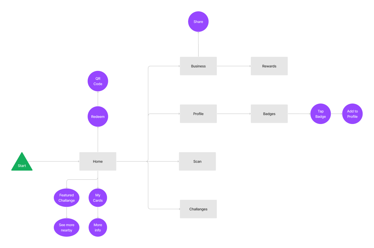
User Flow & Wireframes
Once the concept of our solution was decided on, our group was able to map out the flows & features of our platform to enable the most fluid experience possible for our users. This user flow provided the foundation for the preliminary wireframes of our app.

User Testing
User testing was done in two rounds with distinct purposes for each iteration. Our first round was to validate that the systems in our platform were easy to use and flowed in a logical way. After revisions, our second round of testing was used to confirm that our changes addressed the feedback correctly and tested other features that were left out in the first round.
First Round
Findings
Card wallet was not prominent enough on dashboard
Confusing call to action to access certain features
Clarification of rewards tiers and business information
Revisions
Dashboard hierarchy restructured to re-prioritize redemption and cards
Prominence given to clickable features to navigate to other areas
Expandable rewards tier cards to provide additional information
Second Round
Findings
Dashboard restructure helped navigation and access to information
Users expressed less incentive to use share features
Membership and challenges systems lack clarity
Revisions
Adding challenges related to sharing and a more intuitive sharing feature
Onboarding screens to provide context for rewards programs
Additional changes to consistency and clarity
Final Prototype

Challenges
Monthly and Featured Challenges push users to engage with the community around them and try new things. Featured Challenges celebrate the community with themed challenges that support groups such as sustainable businesses, black-owned businesses and women-owned businesses.

Sharing & Personalization
Show off and share the badges that you’ve earned through challenges. Users have the ability to feature badges on their profile or share out to other social media platforms.
Membership & Rewards
Track your rewards and memberships with different businesses all in one place. Easily redeem rewards you’ve earned that appear at the top for quick access. Check your progress at a glance in your card wallet that stores all memberships.

Scan
Scanning is the primary way to earn points within the platform. Users can scan the QR code of a business to track points earned from a transaction or check in to the store or an event to earn even more points.


Future Considerations
refine visual design further
If I had more time for this project, I would continue to work on the visual design of the platform to create a more cohesive visual identity. Our current visual design has a lot of personality and distinction but lacks consistency and polish due to time restraints. Given more time, a more structured design system could be established to improve the overall design.
(I am currently exploring a new design system and will update this case study when complete. Preview is available here.)
business perspective
What would the app look like from the eyes of a small business owner setting up their loyalty program? What tools could we provide them to best engage with their local community and members? If I had more time for this project, I would look to better understand the small business owner perspective and design an experience that speaks to their pain points and needs.
Learnings
preventing scope creep
Working in a team of 4 designers meant having 4 different visions for our solution. additional features kept being pushed that were nice to have but did not relate directly with our design challenge or our core user needs. I learned the importance of establishing a common vision early on and defining the scope of the project so that time won’t be wasted on unnecessary additions.
being more agile and more iterative
As an academic project, our schedule was dictated by our project submission deadlines. We had two major user testing and revision cycles and therefore 2 major iterations. It would have been nice to take a more agile approach and push iterations for all the major criticism and feedback that we received instead of compiling a long list of revisions to tackle at once. Doing so would have caught many of the issues that we ended up facing and allowed for more flushed out features.
See More

Wanderers

Coming Soon